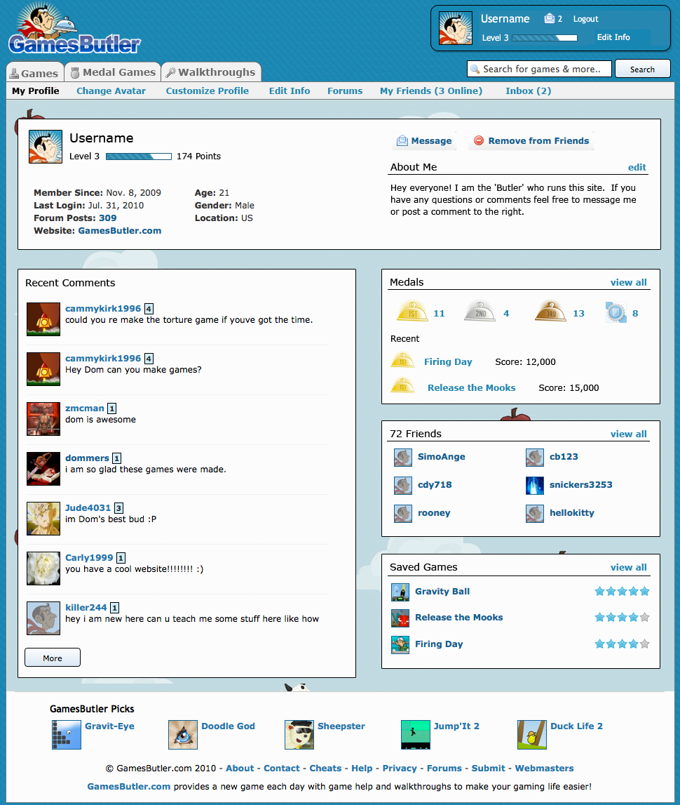
New profile page feedback! Let me know what you think:
http://www.gamesbutler.com/images/profile-design-aug-1.png
+10 points, the more feedback the better!
Also I'm going to try to give points out whenever I see your post instead of doing everyone at once at the end of the week.
Weekly Bonus Points: August 1st - August 8th
44 posts
August 1, 2010


Ohhhh. LOVE it! I really like the fact that it displays your medals and whatnot. The placement of everything is also really refreshing. ^^ No complaints from me. I'm absolutely in love with the new design. x3
August 1, 2010

i really like it cool that you added how many of your friends are online and your medels
August 1, 2010

Ok i deffinetly love the points bar.
Its like an exp bar, shows you how much you have left till the next level.
And the medals section is a great idea. Shows others what they are going up against.
And placement is just fantastic.
And yes Dom is awesome.
Its like an exp bar, shows you how much you have left till the next level.
And the medals section is a great idea. Shows others what they are going up against.
And placement is just fantastic.
And yes Dom is awesome.

The experience bar is cool, but my favorite part is the medals! Awesome idea Dom! I like the "about me", it's pretty cool on the right side. All in all, my favorite thing is the medal part. Great new touch.
August 1, 2010

ya its really cool i like how you can see how many of ur friends are online

Very cool, and I like the part that shows the medals and the experience bar.
August 1, 2010

cool, now i'll know how many medels i have :D
August 1, 2010

thats cool it tells how many people are online
August 1, 2010

I like, but i have a question - when you click on the veiw all button by the medels, does it show the games that you have them in?
August 1, 2010

i like that it shows all your medals and you have an exp bar for your lvl thats pretty cool
August 1, 2010

cool and my comment is on there!
August 1, 2010

I love it! The medals part is best. I can't wait until this is released!
August 1, 2010
AWESOME!
i lovee it :)
i lovee it :)

it looks kool and i like that it shows how many friends r online and the medal games and all that stuff
August 1, 2010

hey dom, nice profile file layout, i like the way it flows, u know, and i like how u can see how far along in the lvl, like exp, and the medals u can see, it show other people how good u are cant wait till we get it xD
August 1, 2010

72 friends. dang dom you are awesome
August 2, 2010

LIKE I SAID BEFORE, EVERYTHING IS GOOD
August 2, 2010

nice idea i love the idea of the trophy case because i am starting to get better at this i am 2nd place in 1 game and 4th om another
i also like the idea of the bar because i always like to know were im at its so cool
i also like the idea of the bar because i always like to know were im at its so cool
August 2, 2010
trophy case? now that's awesome!

i think that the comment box should still be on the right but other than that its a big change that is amazing
when would the change be...?
when would the change be...?
August 2, 2010

not for me
August 2, 2010

holy crap thats awesome dom!!!!!!!!!! i love the medals and how the the comment box is where it is now and that the my friends tab has how many are online now as well BUT i don't like the about me being to the right it should stay on the left
August 2, 2010

OMG MEDALS OMG OMG OMG CANT WAIT

I like it, it is very clean and crisp and not cluttered like a lot of sites tend to do. It would be nice to have a lot of that information such as medals for bragging purposes. Perhaps there should be a "Suggested by the Butler" area for games to play based off history?
August 2, 2010

It is ok gives the day it is open

i love the friends part how it shows how many r online and i like how it shows the medals and highscores i dont like the limted space on the about me part but its defintly more organized
August 2, 2010

I love the new layout and the way that the info is at the top so its the first thing you see and how my account is in the picture HURRAH

August 2, 2010

its ok

The About Me and Points Bar are good additions and the Medals part is the best
August 3, 2010

ItS PREttY KEWl It WOUldNt BOthER ME iF YOU CHANGEd it

Hi Dom,
As ever, I think you have done a great job with the site. Always looking to improve is a really good thing.
The only comment I would make for now is that you should keep any clickable links as far away from the game area as possible. It is really frustrating when you are in the middle of a frantic game and accidentally click on a link just outside the playing area :)
Keep up the positive work!
August 4, 2010
![[XprT]Vesta](http://www.gamesbutler.com/avatars/7b6fb5f6633e.jpg)
i really actually like it since it is more 'neat'* and escpecially tyhe online friends thing i really like that even better if u could chat with them.the medals bar is also really nice and if u could change all users points collecting bar like the one in the picture hen it would be easier for poeple to knoow how many points are left to collect for the next level so nobdy would have to caculate the remaining points needed to go to the next level.
*=by 'neat' i mean easier to see and click!!
*=by 'neat' i mean easier to see and click!!
Or even better, have a 'black out' screen option when you are playing - everything else is not clickable while you are playing.
that's gotta be worth a bonus 500 points! :)
that's gotta be worth a bonus 500 points! :)
August 4, 2010

awesome nice job that works
August 4, 2010
looks cool shows the meadels and people online also how much points u still need
i like it a lot. layout is awesome. i especially like the high score medal area and recent high scores. to me it looks a lot less clustered, but that's just me.
August 5, 2010
yea i i am going to like the idea until it comes out and then after that i am going to keep liking it and the trophy case is the best because i got 5 alredy i just keep getting better at this u should add more awesome highscore games like the ones u have.The point bar for it to see is nice because i wanna know how much i have left for next level specially because i wanna get to the free t-shirt one. Keep coming up whit awasome ideas den and thanks for this webpage its so cool its the best game website ever i got 139 points and because my mom works and my dad to i can keep playin the coolest games on the web i stay here from4-7 hours a day now .Cant wait until the layout comes out its going to be cool by gotta get more 1st place trophy"s for my case by.\
August 6, 2010

the medals count is rally cool and also with the xp bar
August 7, 2010

I like how the username is so wide and also how the picture is giant! I like the medals and how it shows the top.You should add the highscore games to iit afterwards!I like it isn't cluttered or stuck to gether it is in it is in its own personally box.I wish you could have an instant chat thing pop up when you first log on so you kow which of your friends are online. I love the new layout is all that I am saying.I really hope it actually comes out soon because it is something I would want and it seems like everybody else too you know! i also like the bar to tell you how many more points you have to go! NICE WORK!!!!!!!!!!!
August 7, 2010

i like it

I love the new page, i love how it shows the medals and everything.
August 8, 2010
thanks to everyone who posted! I'm going to close this one a little early and post the next topic in a few minutes...
